Showing posts with label Excel. Show all posts

Monday, December 01, 2014

Selecting Random Transactions - Generating Random Numbers for Auditing

I taught a class recently and one of the students wanted to know how to randomly sample transactions from a list for auditing. He phrased the question this way: "How can I generate a list of random transaction numbers and make sure they don't repeat". Immediately, I thought of a really easy way to answer the question. But to give the literal answer to that question, it takes more effort.

Speaking with the accountants, they let me know that the highest value transactions should be investigated. Also, I should note that when selecting a random sample of transactions from a list, the subset of transactions should be a representative sample of the entire list. Statistics can be used to figure out how many transactions are enough to gather a representative sample, but this article will focus on how to generate the list of unique random numbers once you know how many you need.

The Easy Method

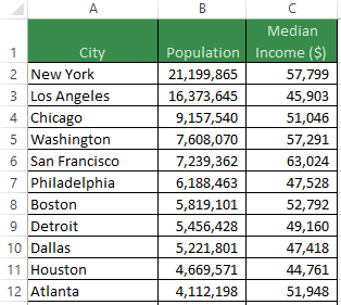
The good thing about the easy method is that it can be done quickly and easily, it just doesn't directly create a list of unique random transaction numbers. List the transactions in an Excel Worksheet, then create a new column to the right of the data set. In the first cell at the top of the column, type the column label as "Random Number". In the cell below type the following formula: =RAND() then hit enter. A random number between 0 and 1 is generated and every time you hit the F9 key or change a cell on the Worksheet, a new random number between 0 and 1 will appear. If you copy and paste this formula down to the end of the transaction list, you can assign a random number to each transaction. At this point, you should copy this new column then paste as values so that the numbers won't change. Now sort the list of transactions based on these random values. You can take the first n rows to create a random subset of transactions.

The Hard Method

Now, to answer the question directly, some formula magic is required. In fact, an array formula is needed to create a unique list of random transaction numbers. To start with, we need a lower and upper boundary of transaction numbers. Type “Lower Bound” in cell C1 and 70 in cell D1. Type “Upper Bound” in cell C2 and 79 in cell D2.

Place a label in cell A1 that says "Unique Random Numbers". Now, in cell A2, type the following formula: =RANDBETWEEN(D1,D2) then press enter. This will generate a random number without decimal places from 70 to 79. Pressing the F9 key or changing a cell on the worksheet will generate another random number within the transaction number boundaries.


Now, an array formula needs to be written in cell A3 that respects the transaction number range, is aware of what is in the cell above, and chooses a random number from the available remaining numbers. The magic formula is:
 =LARGE(ROW(INDIRECT($D$1&":"&$D$2))*NOT(COUNTIF(A$2:A2,ROW(INDIRECT($D$1&":"&$D$2)))),RANDBETWEEN(1,($D$2-$D$1)-ROW(A3)+3))
When entering the formula, make sure to hold down Ctrl+Shift while pressing the Enter key. This is a Ctrl+Shift+Enter array formula.

To understand the formula better, it should be explained step-by-step, so start with:
ROW(INDIRECT($D$1&":"&$D$2)).
When the numbers from D1 and D2 are placed in this formula, the result is each number from 70 to 79 in an array: {70,71,72,73,74,75,76,77,78,79}. We want to select a random number from this array, but not the number that appears above in cell A2, so this array needs to be multiplied by an array of 1’s and 0’s.

COUNTIF(A$2:A2,ROW(INDIRECT($D$1&":"&$D$2))) is the next part of the formula and is tricky to understand. The expandable range to search is A$2:A2, which contains one random number between 70 and 79. The second part of the COUNTIF performs a search for all 10 numbers between 70 and 79. Only one of these 10 numbers can be found in cell A2. If A2 contains the number 79, then this COUNTIF formula will return an array of counts that look like {0,0,0,0,0,0,0,0,0,1}. This array shows us what has been eliminated by the previously generated random number, but we want to know which numbers are still available for selection, so put this COUNTIF inside a NOT function to reverse the logic and switch the 0’s and 1’s to {1,1,1,1,1,1,1,1,1,0}.

=ROW(INDIRECT($D$1&":"&$D$2))*NOT(COUNTIF(A$2:A2,ROW(INDIRECT($D$1&":"&$D$2)))) multiplies the two arrays together. In this example, it would look like {70,71,72,73,74,75,76,77,78,0} because 79 is already selected in cell A2. The next step is to select the first or second or third or maybe the ninth largest number in this array. Place this formula inside a LARGE function to choose, let’s say, the fourth largest number from the remaining numbers: =LARGE(ROW(INDIRECT($D$1&":"&$D$2))*NOT(COUNTIF(A$2:A2,ROW(INDIRECT($D$1&":"&$D$2)))),4)
To get the LARGE formula working, make sure to hold down Ctrl+Shift while pressing the Enter key.

Of course we don’t just want the fourth largest number, we want to randomly choose from the 9 remaining numbers. Replace the 4 with RANDBETWEEN(1,9). Make sure to press Ctrl+Shift+Enter. This formula works well for cell A3, but when it gets copied down to cell A4, there will only be 8 numbers to choose from, so the RANDBETWEEN(1,9) needs to change to RANDBETWEEN(1,($D$2-$D$1)-ROW(A3)+3). The 9 has been replaced with a formula that calculates the difference between the upper and lower bound then subtracts the current row and adds back 3. Ctrl+Shift+Enter this formula.

If you want to follow the action inside the formula using Excel, select cell A3 then click on the Formulas tab and the Evaluate Formula button. Next, press the Evaluate button repeatedly to show the step-by-step calculation.

With cell A3 selected, copy the cell then select A4:A7 and paste the formula. The $ symbols were carefully placed in the formula to make sure that the formula works when copied down. You should always have six unique numbers between 70 and 79. You can change which six numbers appear by pressing the F9 key.


Once you are confident that there will never be a duplicate number, change the values in cells D1 and D2 to a range of transaction numbers. Also, copy and paste the formula in cell A3 down for as many unique random numbers as you want.

If you have any questions for future articles, would like to know more about using Excel, Access Databases, VBA, Charts, need a dashboard, data model, database solution or analytics training, please contact Scott Cuthbertson:

Email: scottjcuthbertson@gmail.com
LinkedIn: http://ca.linkedin.com/in/scottcuthbertson
Blog: http://theanalyticspro.blogspot.ca/

Scott Cuthbertson BBA

Scott is an Analytics Professional who has worked with over 100 clients in the retail and financial services industries. He has helped organizations improve their labour scheduling, inventory replenishment, performance management, organization design and pricing. He has been a practitioner of analytics since childhood, using data models to win Hockey Pools. His expertise lies in developing data models, reporting, algorithms and solutions for any organization that wants to use their data to improve decision making. He also teaches at the CMA Professional Development Institute.

© Scott Cuthbertson 2014 Blog: Words From The Analytics Pro


Saturday, November 01, 2014

Dynamic Ranges, Volume 2 - Drop-Down Menus That Change Based On Selections

Last month we looked at an example of dynamic ranges using a chart that updates automatically based on how much data is available. Since dynamic ranges are of great importance in data modelling and analysis tool-building, I want to share another example.

I have assisted many retailers with data models that involve product hierarchies. One of the most common questions I have heard is how to allow a user to make a selection in one drop-down menu and then have a second drop-down menu change to reflect allowable selections.

In this example, a fashion retailer has three departments (Women, Men and Kids) and within each are categories. Let’s take a look at the data:


There are 8 categories of merchandise in the Women’s department, 6 categories in Men’s and 5 categories in Kids.

The goal is to create two drop-down menus. The first menu allows a user to select one of the three departments and the second menu will automatically allow category selections from the chosen department.

The Department Drop-Down Menu

Excel has a great feature for validating data input called Data Validation. This button is located on the Data tab of the ribbon. If you place the selection in cell H2 then click on Data Validation, the Data Validation dialog box will appear. On the Settings tab is an Allow: drop-down and it should be set to List in order to create a list of allowable departments. Next, the Source textbox needs to know where to get the values for the list, so select the cell range =$A$1:$C$1. Click OK and now cell H2 is a drop-down menu that only accepts one of the three department names. Type “Department” in cell G2 as a label for the drop-down menu.


Two Important Things To Know

In order simplify this example, now is a good time to capture two pieces of information. The selected department appears in which column? How many categories exist for the selected department?

To figure out which column contains the selected department information, type the following function in cell E2: =MATCH(H2,A1:C1,0). This function will lookup the selected department in cell H2 and then search the range A1:C1 to find the value and return its position in the range. The third argument is a zero and it asks for an exact match. If you select the Kids department in cell H2, then cell E2 should return a 3.

To count the number of categories in the selected department, type the following function in cell E3: =COUNTA(INDEX(A2:C9,0,E2)). This function will look at the A2:C9 range then return all rows (the number 0 represents all rows) for the column number in cell E2. For this dynamic cell range, the COUNTA function will count how many cells contain a category value. If you select the Men’s department, then cell E3 should return a 6.


The Category Drop-Down Menu

The final task is to create a category drop-down menu that understands which department was selected. Select cell H3 so that another data validation list will appear there. Click on Data Validation and from the Settings tab allow another List. The Source this time will not be a fixed range such as =$A$1:$C$1 but will be a dynamic range. An OFFSET function can be typed into the Source text box. Type in the following: =OFFSET($A$1,1,$E$2-1,$E$3,1). This function starts at cell A1, then moves down one row, then moves to the right E2-1 columns. Once at this cell, the dynamic range will contain the number of rows from E3 with 1 column of width. If you make a selection from the category drop-down menu, you should only be able to choose categories within the previously selected department. Add a label in cell G3 for “Category”.

When you test the two drop-downs, the finished example should look like this:


If you have any questions for future articles, would like to know more about using Excel, Access Databases, VBA, Charts, need a dashboard, data model, database solution or analytics training, please contact Scott Cuthbertson:

Email: scottjcuthbertson@gmail.com
LinkedIn: http://ca.linkedin.com/in/scottcuthbertson
Blog: http://theanalyticspro.blogspot.ca/

Scott Cuthbertson BBA

Scott is an Analytics Professional who has worked with over 100 clients in the retail and financial services industries. He has helped organizations improve their labour scheduling, inventory replenishment, performance management, organization design and pricing. He has been a practitioner of analytics since childhood, using data models to win Hockey Pools. His expertise lies in developing data models, reporting, algorithms and solutions for any organization that wants to use their data to improve decision making. He also teaches at the CMA Professional Development Institute.

© Scott Cuthbertson 2014 Blog: Words From The Analytics Pro


Saturday, October 04, 2014

Dynamic Ranges, Volume 1 - Charts That Automatically Grow When Data Is Added

In analytics, dynamic ranges are important when working in Excel because they give a data model the flexibility to adjust to changes such as adding or deleting data.

It is generally frowned upon in Excel data models to hard-code values; it is good practice to refer to cells that contain input values so that the model can be easily updated by changing the input-cell values.

However, there is another type of hardcoding happening in Excel models – the static range. Most often, it is fine to type in a formula such as =SUM(B3:B14), but if you want the range to expand with new data in cell B15, you need a range that is dynamic.

A good introduction to dynamic ranges is the example of a chart that requires monthly updates. Here is some monthly sales data to create a Clustered Column chart.


If you create a chart based on the data in cells A1:C5, it may look like the one pictured below. However, when you add data in row 6 for the month of May, the chart won't update by itself. Some may choose to manually update their ranges on a monthly (perhaps weekly or daily) basis, but this can be automated by setting dynamic ranges that grow on their own.


Excel Tables

An underused feature of Excel is the Excel Table. A range of spreadsheet data can be converted to a table by simply selecting a cell in the data then clicking on the Insert tab - Tables group - Table button (Ctrl-T for my keyboard shortcut friends).

The data remains unchanged but now that it is in a table format, one of the newly granted abilities is for a table to automatically grow or shrink. If you add data in row 6 for May, the chart will automatically expand its range to accommodate the new month.


Named Ranges And The Offset Function

A more advanced and powerful way to set up a dynamic range is to use named ranges. We can create a named range that refers to a cell range that can change. This example begins with the January to April dataset on a worksheet called Sales, not the Excel table where May data was just added.

Click on the Formulas tab - Defined Names group - Name Manager button to open up the Name Manager dialog box. Create a new named range by clicking on the New button. The name of the range will by TYSales and instead of hardcoding a reference, we can use the OFFSET function to refer to a dynamic range. Type the following in the Refers to box: =OFFSET(Sales!$B$1,1,0,COUNT(Sales!$B:$B),1)

The five arguments in the OFFSET Function return the range B2:B5 using the following logic: start at cell B1 on the Sales worksheet, go down 1 row, go to the right 0 columns, make the height of the range equal to the count of numbers in column B, make the width of the range equal to 1 cell wide.

Once the first named range is complete, create a named range called LYSales where the reference is defined by =OFFSET(Sales!$C$1,1,0,COUNT(Sales!$C:$C),1) and another named range called Labels where the reference is defined by =OFFSET(Sales!$A$1,1,0,COUNT(Sales!$C:$C),1).

The final step will be to let a new chart know that these three named ranges, TYSales, LYSales and Labels will supply the data.

Create a new Clustered Column chart then click on the Design Tab – Data Group - Select Data button. Add a data series with a Series Name of ="TY Sales" and Series Values of =Sales!TYSales. The equals symbol is followed by the name of the worksheet, an exclamation point then the named range. Once the series is added, edit the Horizontal (Category) Axis Labels by setting the Axis Label Range to =Sales!Labels. Finally, add one more data series for last year sales. The Series Name is =”LY Sales” and the Series Values should be set to =Sales!LYSales.


The chart is complete and uses dynamic ranges that respond to how much data is provided. Add data in rows 6 through 8 for May, June and July and watch the chart change as you complete each cell. The chart will also shrink if you delete the row at the bottom of the data multiple times.

If you have any questions for future articles, would like to know more about using Excel, VBA, Charts, need a dashboard, data model, database solution or analytics training, please contact Scott Cuthbertson:

Email: scottjcuthbertson@gmail.com
LinkedIn: http://ca.linkedin.com/in/scottcuthbertson
Blog: http://theanalyticspro.blogspot.ca/

Scott Cuthbertson BBA

Scott is an Analytics Professional who has worked with over 100 clients in the retail and financial services industries. He has helped organizations improve their labour scheduling, inventory replenishment, performance management, organization design and pricing. He has been a practitioner of analytics since childhood, using data models to win Hockey Pools. His expertise lies in developing data models, reporting, algorithms and solutions for any organization that wants to use their data to improve decision making. He also teaches at the CMA Professional Development Institute.

© Scott Cuthbertson 2014 Blog: Words From The Analytics Pro


Wednesday, September 10, 2014

Optimization Of Resources - Using Excel Solver To Aid Decision Making

When an Excel data model is created and some cells require input from the user, the scenario outcome can change for better or worse. Here is a simple example of an organic baked goods production model where there are constrained resources available to make apple pies, boxes of cookies and cinnamon buns.

The limited available organic ingredients for tomorrow’s production is 350 cups of sugar, 450 cups of flour and 400 cups of butter.

An apple pie requires 1 cup of sugar, 0.5 cups of flour and 1 cup of butter. A minimum of 10 pies must be made to fill the shelf and each pie produces $1.00 of profit.

A box of cookies requires 2 cups of sugar, 4 cups of flour and 1 cup of butter. A minimum of 30 boxes must be produced and each box yields $5.00 of profit.

A box of cinnamon buns requires 1 cup of sugar, 3 cups of flour and 2 cups of butter. A minimum of 15 boxes is required and each will produce $4.00 in profit.

Setting Up The Model


The decision to be made is how many apple pies, boxes of cookies and cinnamon rolls to produce. These decisions are input by the user in the yellow cells C2:E2. In order to respect the minimum presentation requirement, these production numbers should be at least as big as the values in cells C4:E4. Cells C6:E8 detail how many cups of each organic ingredient are required to produce one unit of each baked good. The values in cells C10:E12 multiply the per-unit ingredient requirements by the number of units to produce in cells C2:E2 (40 boxes of cookies require 80 cups of sugar, 160 cups of flour and 80 cups of butter). Cells C14:E14 displays the per-unit profit of each baked good and C15:E15 multiplies these values by the number of units produced. Since there are only 350 cups of sugar available, this maximum is displayed in cell I10 alongside the total sugar consumed by the three products in G10. Cells G11:I12 display the cups of flour and butter used as well as the cups available.

The Initial Solutions

With a production schedule of 20 apple pies, 40 boxes of cookies and 30 cinnamon rolls, the presentation requirements are met, the three constrained ingredients are available and $340 of profit is earned.

Of course, more profit could be earned if additional baked goods are produced, but how many units of each should be added to yield the greatest profit? Since cookies have the highest profit per unit, we can change the production to 70 units. Cinnamon rolls also produce a good profit but use less flour, maybe we should increase production to 50 units. At this point we are constrained on flour and can only make a total of 40 apple pies. All of the flour has been used up but sugar and butter are still available while the profit earned is $590. Is there another solution that makes better use of the ingredients and yields more profit?

Excel Solver

This is a type of problem that is difficult to solve using trial and error but simple with Excel’s Solver Add-In. The Solver button appears in the Data tab of Excel’s ribbon. If you don’t see the Solver button, you need to enable the Add-In. Click on the File Tab then select Options and when the Excel Options dialog appears, select the Add-Ins tab. Click on the Go button to bring up a menu of Add-Ins that can be enabled or disabled, check the box for the Solver Add-In then click on OK. The Solver Add-In should be added to the Data tab in Excel, if not then quit Excel and open the Excel application again.

The Optimal Production Schedule

Click on the Solver button to set up the optimization model. The Set Objective box should be cell G15 and the To button should be Max because we want to maximize the value in cell G15, the total profit. The By Changing Variable Cells box should be cells C2:E2, the decision input cells that can
change their values. Next, click the Add button to make the Add Constraint dialog box appear. The Cell Reference of C2:E2 should be set to greater than or equal to the Constraint of C4:E4. Notice that three constraints are being specified at once instead of one cell at a time. Click Add to add another constraint. The next constraint is that G10:G12 should be less than or equal to I10:I12. The last constraint is the fact that C2:E2 must be integers; we can’t create half of a pie. In order to set this constraint, the Cell Reference is C2:E2 and the drop-down menu is set to “int” (which will then place the word “integer” in the Constraint box). Click OK to close the Add Constraint dialog box. The Solver model is ready to choose the optimal solution, so click the Solve button and when the solution is ready, click OK to return to the model.

The Optimal Solution


Excel Solver has found an interesting solution where 216 apple pies, 30 boxes of cookies and 74 cinnamon rolls are made. This solution makes good use of the ingredients as only 6 cups of butter will remain. The profit of this solution is $662, higher than what we could likely produce with trial and error. It seems counterintuitive that production of the highest per-unit profit item (cookies) is low but that makes sense considering that cookies use more flour than the other baked goods. If making 216 apple pies is unreasonable and risks spoilage, a new constraint could be added to this model that specifies a maximum level of production for each baked good.

Whether you need to allocate different products to stores at varying prices or allocate hours to employees with varying wage costs and sales performance, models such as this one can be created to maximize profits or minimize costs given a set of constraints.

If you have any questions for future articles, would like to know more about using Solver, Excel, VBA, Charts, need a dashboard, data model, database solution or analytics training, please contact Scott Cuthbertson:

Email: scottjcuthbertson@gmail.com
LinkedIn: http://ca.linkedin.com/in/scottcuthbertson
Blog: http://theanalyticspro.blogspot.ca/

Scott Cuthbertson BBA

Scott is an Analytics Professional who has worked with over 100 clients in the retail and financial services industries. He has helped organizations improve their labour scheduling, inventory replenishment, performance management, organization design and pricing. He has been a practitioner of analytics since childhood, using data models to win Hockey Pools. His expertise lies in developing data models, reporting, algorithms and solutions for any organization that wants to use their data to improve decision making. He also teaches at the CMA Professional Development Institute.

© Scott Cuthbertson 2014 Blog: Words From The Analytics Pro


Saturday, June 14, 2014

Creating Excel Charts Using VBA - A Picture Is Worth 1,000 Words

Most people struggle to see the patterns and relationships present when looking at a table of data. For example, take a look at this table which details the deposits, branches and employees for some Canadian Banks. Without spending too much time scrutinizing the numbers, can you tell which banks are the most similar?


Using A Chart To Visualize The Data

If you want to effectively communicate a message to an audience, a chart can let the data quickly speak for itself. A basic Excel scatter chart with branches on the vertical axis and employees on the horizontal axis will give you a better idea of which banks are most similar. Unfortunately, we can’t easily tell which bank is which and deposits have not been reflected in the chart.


Formatting the chart as a bubble chart will make the visualization more presentable. This chart not only shows the number of branches and employees for each bank, but the size of the logo indicates the magnitude of the deposits. This chart quickly conveys the relationships and patterns of three variables. Now you can group similar banks together instantly.


Building Charts With Excel Visual Basic For Applications (VBA)

This chart was built using VBA but it could have been created manually. For this particular chart, writing the code and building the chart manually may take about the same amount of time, but coding offers advantages. First, the code can be reused to create similar charts without having to rebuild the chart manually. Second, there were only 11 points on the chart, but if there were more points, it would take too long to build manually.

Animating Benchmarking Charts

One of the more popular charts I have offered clients is the Benchmarking Chart. It is a good visualization for comparing a company or employee to peers along several metrics. This chart can be created manually or using VBA. However, if you want to see this chart progress from period 1 through 12 automatically, you will need to create a motion chart using VBA.

Upcoming Course

If you would like to know more about using Excel VBA code to create charts, I will be teaching a one-day course called: Microsoft Excel VBA – Focus on Charts & Visualizations. Join me at the Certified Management Accountants Professional Development Institute. The charts above will be covered in the course and will give you the foundation to invent new charts to communicate your messages.

To give you an idea of what is possible after practicing Excel charting with VBA, here are some examples of complex charts which are only feasible with VBA.


If you are interested in learning more about Excel charts or VBA, need a data model, a database solution or analytics training, please contact Scott Cuthbertson:

Email: scottjcuthbertson@gmail.com
LinkedIn: http://ca.linkedin.com/in/scottcuthbertson
Blog: http://theanalyticspro.blogspot.ca/

Scott Cuthbertson BBA

Scott is an Analytics Professional who has worked with over 100 clients in the retail and financial services industries. He has helped organizations improve their labour scheduling, inventory replenishment, performance management, organization design and pricing. He has been a practitioner of analytics since childhood, using data models to win Hockey Pools. His expertise lies in developing data models, reporting, algorithms and solutions for any organization that wants to use their data to improve decision making. He also teaches at the CMA Professional Development Institute.

© Scott Cuthbertson 2014 Blog: Words From The Analytics Pro


Monday, May 19, 2014

Why is my VLOOKUP not working? - Four Opportunities To Improve Your VLOOKUP

This past week at a client site, I was asked a question that I have heard numerous times: Why is my VLOOKUP not working? I have seen issues with all of the four arguments required by this function and each presents an opportunity to improve your data model.

lookup_value

I will keep the data set simple: population and median income for each city in the United States. This data set contains 503 cities.

Elsewhere in this spreadsheet, we need to lookup the population and median income of two cities: Buffalo and Hartford.

The text “Buffalo” is located in cell L2 and the VLOOKUP function to lookup the population will be written in cell M2.

The formula can be written as:
=VLOOKUP(L2,A2:C504,2,FALSE)

The first argument in the function is the lookup_value and represents what we want to look for. In this case we are looking for “Buffalo” which is in cell L2.

The second argument is table_array and represents the data source for retrieving the population of Buffalo. The table_array is in cells A2 to C504.

The third argument is col_index_num and represents which column in the table_array to return as our result. The population is in the second column, so we specify a value of 2.

The fourth argument is range_lookup and accepts values of TRUE (1) or FALSE (0). FALSE is “exact match” and only allows an exact match of Buffalo to return a result. TRUE is “approximate match” and will return the closest value to Buffalo if the table_array is sorted in the first column (City, from A to Z).

Here is the result of the formula, an #N/A error. The problem is that in cell L2, there is a space character after “Buffalo”. This is a common problem that is harder to find when many VLOOKUP functions are written. An easy way to resolve this issue in the lookup_value argument is with the TRIM function, which will remove all spaces from a string except for single spaces between words. The formula should be rewritten as:
=VLOOKUP(TRIM(L2),A2:C504,2,FALSE)


table_array

This formula in cell M2 can now be copied and pasted down one cell to M3. The resulting formula is:
=VLOOKUP(TRIM(L3),A3:C505,2,FALSE)

This formula returns the correct result for Hartford, but the table_array is no longer correct. The data source is now cells A3 to C505. New York is no longer in the table_array and every time this formula gets pasted one row further down, another city will be removed. To improve the table_array argument, add $ symbols to make it an absolute reference.
=VLOOKUP(TRIM(L3),$A$2:$C$504,2,FALSE)

Now the table_array will always remain the same. Unfortunately, if you add data to the bottom of the table starting in row 505, it won’t be visible to the function. Therefore, another way to write this formula is by using entire columns instead of specifying rows:
=VLOOKUP(TRIM(L3),$A:$C,2,FALSE)

This formula will copy and paste downwards without losing any data and also allows the data to grow.

col_index_num

The third argument is typically hardcoded as a number, in our case the second column is represented by a 2. There are two common issues created by hardcoding column references.

The first issue is what happens when you insert a column inside your table_array cell range. The State for each city has been added to the data and the Population is no longer in column 2, it is now in column 3. Excel does not update the VLOOKUP function because the col_index_num argument has been hardcoded. The Population lookup is now returning State instead because that is what appears in column 2.


The second issue is what happens when you copy and paste the formula in cell M2 to the right. If we want to add a VLOOKUP of Median Income in column N then we should add a $ symbol to the lookup_value ($L2):
=VLOOKUP(TRIM($L2),$A:$C,2,FALSE).


When this formula is copied and pasted to the right, nothing in the formula changes, so we have to manually change the col_index_num to 3. If we had more columns in our table_array such as Crime Rate or Unemployment Rate, we would copy and paste this formula to the right two more times and have to manually enter the col_index_num. For dozens of columns, this takes too long and is a risk for errors.

To fortify the col_index_num argument and solve both of these issues, use the COLUMNS function, which will count the number of columns in the cell range it is fed.

Replace the hardcoded value of 2 in the col_index_num argument with COLUMNS($A2:B2) which will evaluate to 2 (the number of columns in the range $A2:B2). The lookup in cell M2 for Buffalo’s population should be: =VLOOKUP(TRIM($L2),$A:$C,COLUMNS($A2:B2),FALSE)

When this formula is copied and pasted to the right, it becomes
=VLOOKUP(TRIM($L2),$A:$C,COLUMNS($A2:C2),FALSE) and the col_index_num now evaluates to 3. The range expands when pasted to the right. Furthermore, when the State column is inserted into the table_array, the col_index_num will also expand and return the correct result.

range_lookup

For just a few VLOOKUP functions, I would recommend using exact match (FALSE or 0) for the range_lookup argument because successful lookups will return the correct result and if the city is not found, an #N/A error is returned. However, if there are thousands of VLOOKUP functions in a data model and the table_array has a large number of rows, it will take a long time to recalculate the workbook. A significant performance boost is achieved by changing the range_lookup argument to approximate match (TRUE or 1). In order to do this, you must sort your table_array by the first column (City) and be sure that Buffalo appears in the table, otherwise you will return the population of the closest alphabetical match to Buffalo which may be Boston.

If you are interested in learning more about strengthening your data models, need a database solution or analytics training, please contact Scott Cuthbertson:

Email: scottjcuthbertson@gmail.com
LinkedIn: http://ca.linkedin.com/in/scottcuthbertson
Blog: http://theanalyticspro.blogspot.ca/

Scott Cuthbertson BBA

Scott is an Analytics Professional who has worked with over 100 clients in the retail and financial services industries. He has helped organizations improve their labour scheduling, inventory replenishment, performance management, organization design and pricing. He has been a practitioner of analytics since childhood, using data models to win Hockey Pools. His expertise lies in developing data models, reporting, algorithms and solutions for any organization that wants to use their data to improve decision making. He also teaches at the CMA Professional Development Institute.

© Scott Cuthbertson 2014 Blog: Words From The Analytics Pro


Sunday, March 09, 2014

Text Manipulation In Microsoft Excel - Three Common Issues and Solutions

Whether you are querying a database, programming in C Sharp or analyzing data in Microsoft Excel, it is important to be aware of data types. There are many data types and the ones encountered most often are Text, Number and Date. Being able to recognize data types and convert them to the desired type will allow you to get on with the more important matter of using the data.

Why Won’t My Formula Add These Numbers?

This is a question I’ve encountered many times. A series of numbers in column D needs to be added but the SUM formula in cell D17 returns zero. If your data is text, even if it appears to be a number, you won’t be able to use it in a calculation.

In the absence of formatting, text aligns to the left side of a cell and numbers align to the right, a clue to the data type in column D.

There are two common approaches to converting text to number. The first is to put a formula in cells E2 to E16 that adds zero to each corresponding number in column D (or multiply each number by one). When you perform math with text that appears to be a number, Excel performs the conversion and the result will be numbers in column E that can be added.

The second approach is to click on the File tab, select Options and then click on the Formulas tab. Make sure that Enable background error checking is checked then click OK to close Options. There will now be a little green marker in the upper-left corner of each cell in column D. The marker indicates an “error”. If you select one cell or all of the cells in column D, a smart tag will appear and clicking on it will offer a selection to Convert to Number. After the conversion, the addition can take place.


How Do I Convert This Text String To A Date?

A more complicated conversion is from Text to Date. Dates can be represented in many different ways using text and sometimes the year, month and day positions can be confusing. Looking at cell C2 in the data, we need a formula in cell E2 to extract the year, month and day. Start the formula with an extraction of the month, character positions 5 and 6. The MID function can extract text from the middle of a string. =MID(C2,5,2) will extract 06 from the string in C2 by starting the extraction at character 5 and returning a length of 2 characters. Next, join the forward slash character to this string being built, the formula should be: =MID(C2,5,2)&"/" and it will return 06/. The & character is used to join text strings together. The next text string to join is the day portion of the date, in character positions 7 and 8. You could use MID(C2,7,2) but you can also use the RIGHT function to return 2 characters from the right side of the string. The formula should now be: =MID(C2,5,2)&"/"&RIGHT(C2,2) and the result is 06/11. Another forward slash should be joined to the formula before the year portion of the date is added. The MID function could be used to extract the year from the first position with a length of four characters, but the LEFT function can also be used to extract text from the left side of the string. The formula is now =MID(C2,5,2)&"/"&RIGHT(C2,2)&"/"&LEFT(C2,4) and returns 06/11/2013. Unfortunately the result is another text string, but the conversion to a date is as simple as surrounding the formula in parentheses and then adding zero. The final formula is: =(MID(C2,5,2)&"/"&RIGHT(C2,2)&"/"&LEFT(C2,4))+0 and the result is 41436, which is exactly what we want. Format this cell with the Number Format drop-down menu on the Home tab. Excel represents June 11, 2013 with the number 41436 (the number of days starting from January 1, 1900) and we can now add or subtract days from this cell to perform date math. This formula can now be copied downwards for as many rows as necessary.

It should be noted that my computer uses a Month-Day-Year format to interpret dates, so 02/03/2012 is February 3, 2012. Another computer with different Windows Regional Settings may interpret this as March 2, 2012, so make sure your conversion gives the desired result. This approach will achieve the desired result in virtually every conversion from Text to Date.

I Don’t Like The Number Format In My Message

After data modeling is complete, it is often desirable to join the results to text strings for charts, visualizations or Infographics. For example, suppose we want to use the sum of column D to calculate a 3% administration charge and display this in a chart message. Since the sum of the invoices appears in cell D17, we can place the message in cell D18 using the formula
="Admin Charge is "&0.03*D17 which displays the resulting message as follows:


No formatting was applied to the calculation before converting it to text. Use the TEXT function to control conversions of dates or numbers to text. The formula should be updated to
="Admin Charge is "&TEXT(0.03*D17,"$#,###.00") to display the following result:


The TEXT formula requires the calculation in the first argument and a format to use when converting to text in the second argument. The format used here is a dollar symbol, number placeholders with a comma to allow thousands separation, a period then two mandatory digits after the decimal for cents.

If you are interested in learning more about converting and formatting data types, let me show your organization how it can improve its Excel models. If you need a data model, database solution or analytics training, please contact Scott Cuthbertson:

Email: scottjcuthbertson@gmail.com
LinkedIn: http://ca.linkedin.com/in/scottcuthbertson
Blog: http://theanalyticspro.blogspot.ca/

Scott Cuthbertson BBA

Scott is an Analytics Professional who has worked with over 100 clients in the retail and financial services industries. He has helped organizations improve their labour scheduling, inventory replenishment, performance management, organization design and pricing. He has been a practitioner of analytics since childhood, using data models to win Hockey Pools. His expertise lies in developing data models, reporting, algorithms and solutions for any organization that wants to use their data to improve decision making. He also teaches at the CMA Professional Development Institute.

© Scott Cuthbertson 2014 Blog: Words From The Analytics Pro


Saturday, February 15, 2014

Simulation In Data Models - Introduce Uncertainty Into Your Life

When data models are built in Excel, assumptions are usually made. For example, take a look at this simple income statement data model (values are in thousands of dollars) and the associated calculations.

Revenue by region is fixed, the Cost of Goods are a percentage of Revenue and Overhead Expenses are fixed.

This model represents a forecast of a company’s Earnings for next year. It is static, so the result is always $170,000.

If this is a best guess at a forecast then the next level is to understand the possible variability in the model’s assumptions and results. How sensitive are Earnings to changes in Revenue?

Random Numbers

Random numbers can be used to add uncertainty to the data model. Even though Canadian Revenue is forecasted at $2,000,000, the worst case scenario is $1,500,000 and the best case scenario is $2,500,000. To reflect this in the data model, a random number in this range can be used instead of hard-coding $2,000,000. There are two common ways to implement this uncertainty in Excel:

=RANDBETWEEN(1500,2500)
=1500+RAND()*1000

The RANDBETWEEN Function in Excel will randomly select a number within the range specified, including the lower and upper limits provided. Press the F9 key to trigger a recalculation of the Workbook.

The RAND() Function generates a random number between 0 and 1 (includes 0 but not 1). This value can be multiplied by 1,000 and added to 1,500 to generate a random number between 1,500 and 2,500.

USA and International revenue can also incorporate uncertainty in their values. USA revenue will range from $600,000 to $1,000,000. International revenue will range from $100,000 to $300,000.

Simulation: An Unorthodox Use Of Data Tables

Every time the F9 key is pressed, a recalculation of the Workbook will occur but the new scenario is not being captured. In order to capture the results from each scenario, you can use Visual Basic for Applications (VBA) code, but an easier way to capture the results is to use Data Tables.

Data tables are conventionally used to substitute a value from the first column in the table into a model parameter input cell in order to change the model and capture its result. However, in simulations, data tables can be used simply to trigger a recalculation of the same model and capture the result.

To set up the data table in this example, there is a formula in cell F2 (=B18) set to the model output: Earnings. Starting on the next row, one column to the left, fill down the number of scenarios desired. In this example I would like 10,000 scenarios. Next, highlight the top row and the rest of the table down to the last scenario. From the Excel Data ribbon, look in the Data Tools group and select What-If Analysis then Data Table.

Typically, when the Data Table dialog appears, the Column input cell (column of 10,000 values) is set to a cell in the data model where the numbers 1 to 10,000 will be placed before a recalculation, but in this case, all we want is a recalculation, so select a blank cell such as $S$17. Each of the 10,000 values will be placed in cell $S$17, forcing a recalculation, then then result at the top of the Data Table (cell F2) will be captured in each row below. Click OK to run 10,000 scenarios of the data model and capture each Earnings value.

Understanding The Distribution Of Model Results

In order to understand the results, first copy and paste the Data Table as values so they will not change on the next recalculation. Next, sort the Earnings from lowest to highest. With the sorted range selected, create a Line Chart to show how the simulation results are distributed. The chart shows that there are about 900 of 10,000 scenarios where Earnings are negative, which corresponds to a 9% chance of losing money based on the current model assumptions. If the target Earnings are $300,000, we can see that about 17% of the 10,000 scenarios yielded a value of $300,000 or greater.

These concepts are even more powerful with larger data models. Also, simulation can also use bell-shaped or other distributions instead of a simple RANDBETWEEN Function. Simulation is about understanding how sensitive results are to changes in assumptions. This allows the modeller to assign probabilities to the likelihood of scenarios and take action early to change the outcome.

If you are interested in learning more about Excel Data Model Simulation, let me show your organization how it can introduce uncertainty into its Excel models. If you need a data model, database solution or analytics training, please contact:

Email: scottjcuthbertson@gmail.com
LinkedIn: http://ca.linkedin.com/in/scottcuthbertson
Blog: http://theanalyticspro.blogspot.ca/

Scott Cuthbertson BBA

Scott is an Analytics Professional who has worked with over 100 clients in the retail and financial services industries. He has helped organizations improve their labour scheduling, inventory replenishment, performance management, organization design and pricing. He has been a practitioner of analytics since childhood, using data models to win Hockey Pools. His expertise lies in developing data models, reporting, algorithms and solutions for any organization that wants to use their data to improve decision making. He also teaches at the CMA Professional Development Institute.

© Scott Cuthbertson 2014 Blog: Words From The Analytics Pro