Showing posts with label Excel VBA. Show all posts

Saturday, June 14, 2014

Creating Excel Charts Using VBA - A Picture Is Worth 1,000 Words

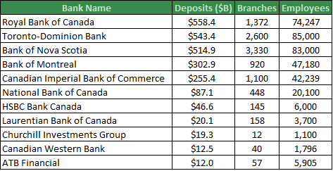
Most people struggle to see the patterns and relationships present when looking at a table of data. For example, take a look at this table which details the deposits, branches and employees for some Canadian Banks. Without spending too much time scrutinizing the numbers, can you tell which banks are the most similar?


Using A Chart To Visualize The Data

If you want to effectively communicate a message to an audience, a chart can let the data quickly speak for itself. A basic Excel scatter chart with branches on the vertical axis and employees on the horizontal axis will give you a better idea of which banks are most similar. Unfortunately, we can’t easily tell which bank is which and deposits have not been reflected in the chart.


Formatting the chart as a bubble chart will make the visualization more presentable. This chart not only shows the number of branches and employees for each bank, but the size of the logo indicates the magnitude of the deposits. This chart quickly conveys the relationships and patterns of three variables. Now you can group similar banks together instantly.


Building Charts With Excel Visual Basic For Applications (VBA)

This chart was built using VBA but it could have been created manually. For this particular chart, writing the code and building the chart manually may take about the same amount of time, but coding offers advantages. First, the code can be reused to create similar charts without having to rebuild the chart manually. Second, there were only 11 points on the chart, but if there were more points, it would take too long to build manually.

Animating Benchmarking Charts

One of the more popular charts I have offered clients is the Benchmarking Chart. It is a good visualization for comparing a company or employee to peers along several metrics. This chart can be created manually or using VBA. However, if you want to see this chart progress from period 1 through 12 automatically, you will need to create a motion chart using VBA.

Upcoming Course

If you would like to know more about using Excel VBA code to create charts, I will be teaching a one-day course called: Microsoft Excel VBA – Focus on Charts & Visualizations. Join me at the Certified Management Accountants Professional Development Institute. The charts above will be covered in the course and will give you the foundation to invent new charts to communicate your messages.

To give you an idea of what is possible after practicing Excel charting with VBA, here are some examples of complex charts which are only feasible with VBA.


If you are interested in learning more about Excel charts or VBA, need a data model, a database solution or analytics training, please contact Scott Cuthbertson:

Email: scottjcuthbertson@gmail.com
LinkedIn: http://ca.linkedin.com/in/scottcuthbertson
Blog: http://theanalyticspro.blogspot.ca/

Scott Cuthbertson BBA

Scott is an Analytics Professional who has worked with over 100 clients in the retail and financial services industries. He has helped organizations improve their labour scheduling, inventory replenishment, performance management, organization design and pricing. He has been a practitioner of analytics since childhood, using data models to win Hockey Pools. His expertise lies in developing data models, reporting, algorithms and solutions for any organization that wants to use their data to improve decision making. He also teaches at the CMA Professional Development Institute.

© Scott Cuthbertson 2014 Blog: Words From The Analytics Pro


Sunday, November 17, 2013

Reclaim Your Weekend With Excel VBA - Three Common Repetitive Tasks To Automate

Whenever I mention “VBA”, business professionals tremble at the thought of programming code. However, I believe that a little coding ability is the next frontier for those who need to transform data into information to generate insights and make decisions. Coding is not exclusively the domain of developers and technology professionals. Business professionals can achieve 80% of the benefits by knowing 20% of the code. Since Microsoft Excel is the world’s most popular analytics tool, it makes a lot of sense to introduce coding using this comfortable environment.

When I was unfamiliar with Excel VBA (Visual Basic for Applications), I was working weekends in order to compile, clean, validate and finally analyze the data I was given. Fifteen years later, I automate the repetitive processes and devote most of my time to asking questions about the data and looking for the answers. I have seen countless colleagues struggle to analyze data because it never seems to arrive in a desirable format, so a lot of time is spent preparing data for analysis and much less time is spent performing analysis. My best experiences have been 5% data preparation and 95% analyzing the data to uncover the best questions and insights.

Investing a little time to learn how to automate a repetitive process will save you much more time in the long run. If you find yourself repeating the same tasks over and over, it can be automated. Here are three common time consuming problems in Excel data analysis and solutions that use Excel VBA.

“Unpivoting” Data

It amazes me how much data arrives in the following format:


This data is really a report which displays sales for each store (rows) and each week (columns). The format can be described as cross-tabulated or pivoted. I never recommend doing data analysis using this format because it is more difficult to manipulate than the exact same dataset in the following format:

The data to the left is “unpivoted” and is ideal for sorting, filtering and aggregating. I figure that business professionals naturally have a preference for this format because I am often asked to “unpivot” their data table.

If the dataset is small, then it won’t take too long to rearrange the cells manually, but how about hundreds of rows and columns? Automation is even more important if this needs to be done repeatedly on a weekly basis.

The first tool I reach for is Excel VBA which can easily automate the transformation of the data. The code would loop through each row and each column of the pivoted data, noting the column’s date, the row’s store number and the sales value and would then add it to the next blank row in a new “unpivoted” data table. A weekend’s work could be reduced to 30 minutes of coding and a few seconds to run the procedure.


Working with Many Files

A former colleague of mine once told me how she had to spend her weekend compiling data by repeating the following steps: Open a client data file, copy and paste several ranges of cells into a Master Workbook then close the client data file. Each client data file represented a store and this client had 300 stores! Not only did the process take a long time, but there were also a few errors made and one store was overlooked altogether. When a manual process takes a long time and errors are inevitable from repetitive fatigue, Excel VBA is a preferable alternative because it will execute quickly and will not contain human error. With Excel VBA, it is easy to loop through all of the Excel files in a folder and automatically extract and append the desirable data ranges to a Master Workbook. A weekend’s work could be reduced to 30-60 minutes of coding and a few minutes to run the procedure.

Creating Charts

Visualization is one of the key elements of communicating the patterns hidden in a dataset. If the data is already in Excel, simple charts can be generated quickly but complex charts can be time consuming. Another former colleague of mine used to create PowerPoint presentations as a full-time job. One of the reasons why he had no time for anything else was because all of his charts were built manually. Simple line or column charts should be built manually. However, as charts become more complex, there can be a lot of clicking and selecting cell ranges. Furthermore, if the chart needs to be recreated monthly for datasets that change, it makes sense to automate the process. A weekend’s work could be reduced to 30-60 minutes of coding and a few seconds to run the procedure.

Here are two examples of charts that would take a long time to create manually, but using code they can be created and recreated in seconds.


After learning Excel VBA to extend your Excel capabilities, you will discover that VBA can also be used to automate many more tasks such as the distribution of Emails to a large group of recipients or the creation of multiple PowerPoint presentations.

Stop the repetitive stress and start automating common Excel tasks with VBA in order to reclaim your weekend.

Scott Cuthbertson BBA

Scott is an Analytics Professional who has worked with over 100 clients in the retail and financial services industries. He has helped organizations improve their labour scheduling, inventory replenishment, performance management, organization design and pricing. He has been a practitioner of analytics since childhood, using data models to win Hockey Pools. His expertise lies in developing data models, reporting, algorithms and solutions for any organization that wants to use their data to improve decision making. He also teaches at the CMA Professional Development Institute.

If you are interested in analytical solutions or training:

Email: scottjcuthbertson@gmail.com
LinkedIn: http://ca.linkedin.com/in/scottcuthbertson
Blog: http://theanalyticspro.blogspot.ca/

© Scott Cuthbertson 2013 Blog: Words From The Analytics Pro