
Using A Chart To Visualize The Data
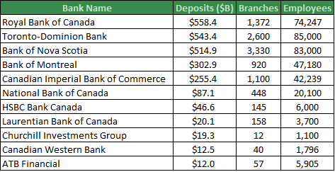
If you want to effectively communicate a message to an audience, a chart can let the data quickly speak for itself. A basic Excel scatter chart with branches on the vertical axis and employees on the horizontal axis will give you a better idea of which banks are most similar. Unfortunately, we can’t easily tell which bank is which and deposits have not been reflected in the chart.

Formatting the chart as a bubble chart will make the visualization more presentable. This chart not only shows the number of branches and employees for each bank, but the size of the logo indicates the magnitude of the deposits. This chart quickly conveys the relationships and patterns of three variables. Now you can group similar banks together instantly.

Building Charts With Excel Visual Basic For Applications (VBA)
This chart was built using VBA but it could have been created manually. For this particular chart, writing the code and building the chart manually may take about the same amount of time, but coding offers advantages. First, the code can be reused to create similar charts without having to rebuild the chart manually. Second, there were only 11 points on the chart, but if there were more points, it would take too long to build manually.
Animating Benchmarking Charts
One of the more popular charts I have offered clients is the Benchmarking Chart. It is a good visualization for comparing a company or employee to peers along several metrics. This chart can be created manually or using VBA. However, if you want to see this chart progress from period 1 through 12 automatically, you will need to create a motion chart using VBA.

Upcoming Course
If you would like to know more about using Excel VBA code to create charts, I will be teaching a one-day course called: Microsoft Excel VBA – Focus on Charts & Visualizations. Join me at the Certified Management Accountants Professional Development Institute. The charts above will be covered in the course and will give you the foundation to invent new charts to communicate your messages.
To give you an idea of what is possible after practicing Excel charting with VBA, here are some examples of complex charts which are only feasible with VBA.


If you are interested in learning more about Excel charts or VBA, need a data model, a database solution or analytics training, please contact Scott Cuthbertson:
Email: scottjcuthbertson@gmail.com
LinkedIn: http://ca.linkedin.com/in/scottcuthbertson
Blog: http://theanalyticspro.blogspot.ca/
Scott Cuthbertson BBA
Scott is an Analytics Professional who has worked with over 100 clients in the retail and financial services industries. He has helped organizations improve their labour scheduling, inventory replenishment, performance management, organization design and pricing. He has been a practitioner of analytics since childhood, using data models to win Hockey Pools. His expertise lies in developing data models, reporting, algorithms and solutions for any organization that wants to use their data to improve decision making. He also teaches at the CMA Professional Development Institute.
© Scott Cuthbertson 2014 Blog: Words From The Analytics Pro
No comments:
Post a Comment